Codebase health, technical debt, technical health, or even code smell. Yes, we’re talking about that. A project with poor codebase health will make a product more difficult to develop, test, and maintain. We won’t dive deep into theory; one can already find many great articles on the internet. Instead, we would like to focus on improving codebase health and eventually making our lives great again as software engineers.
This article will present CHI(氣), which is how we track and improve our project’s codebase health in the mobile team at Bonial.
Back in 2019, we had a company-wide team health check at Bonial. One of the conclusions was that codebase health is a challenge for many tech teams. That’s how I got inspired to develop a visual indicator as a first step to tackle the issue.
The idea was presented to our team, and thankfully, with a lot of cooperation and feedback, it has finally become a useful tool for us to improve our technical health.
Get to the point, please 
Dashboard: The visual indicator
What do we want it to be? Simple, easy to follow, minimum manual work, and transparency
We developed a web app as a dashboard, and the web app updates the information periodically by talking with the Jira API.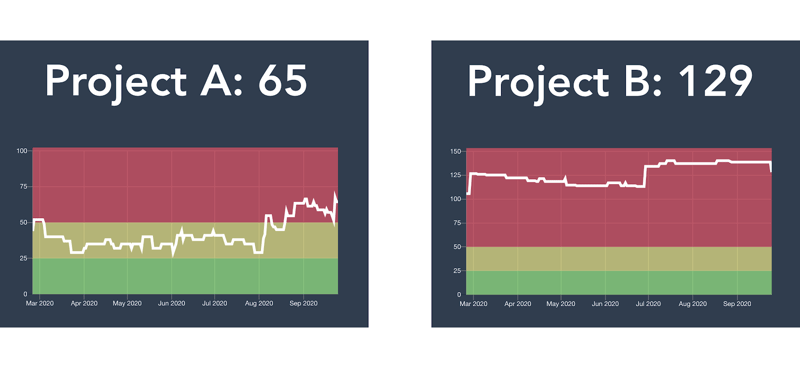
Use debt point to quantify the health
In Project A, the number 65 is the project’s debt point; the lower the number, the better the health. Below it, we see the historical trend over the past few months – which contains some interesting information.
If we look at Project A, one can see that it has more activities than Project B. When the line goes up, we developers detect something in our codebase that needs to be improved – that might be the migration of a legacy code or something is messy and needs some refactoring. This part requires the developer to be proactive and have the capability to detect the issue (Or use Sonarcloud.io, linters to help you).
When the line goes down, it means developers detect the problem and are willing to spend time and effort to address it. In general, we want the line to go down, but there is always room for improvement, isn’t there?
Color code the threshold to make the status easy to understand
We see that there are three colors in the chart as a threshold to indicate the status of our codebase. The threshold is up to the team to decide. It can be presented as faces in the dashboard for everyone to understand (use your creativity!) easily. Another benefit of these colored faces is to assist the team in task prioritization. For example, if the face is red with bandages (the worst one), the team might need to consider putting more resources into improving technical health.
But wait, what are these debt points?
The matrix: The ruler of debt points
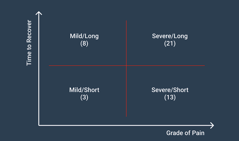
We’ve defined a matrix to simplify the assignment of debt points. The precision of assessment is not essential since it’s not an easy task to assess every task we have (Trust me, we had a lengthy conversation about it, and in the end, we are delighted with this simple matrix).
The X-axis is the severity of the task: Is it a big issue or just nice to have an improvement? “mild” or “severe” are the choices here.
The Y-axis is the required time to solve a problem; here, one can choose “short” or “long.” Simple right? The key is to avoid overthinking and overcomplicating.
In the end, it will become a label for us to assign to our tasks in Jira.
Integration with Jira
Since we use Jira as our task management tool, it’s natural for us to use it as our single source of truth for debt points. This way, our web app can query the data and visualize it as a dashboard.
We have two ways to create a CHI ticket:
- There is a permanent epic “technical debt,” so every task we create under it will automatically be a CHI ticket, and by default, treated as a ”Mild/Short” task.
- We can create an epic if the task is bigger. We do so by assigning a “technical-debt” label and one of the matrix labels to the epic; this way, our dashboard can take them into account.
In Jira, we can create a filtered dashboard to display a list of CHI tickets. It’s quite useful for the team for refinement or assignment.
Where To Go From Here?
In the end, the CHI is just like a live health check report from your doctor, but it can provide you with the transparency and motivation needed to take action. The ups and downs of the chart’s line represent all the effort and time we developers devote to make our codebase better. It’s not just about trying to reach that green smiley face (yes, we do!  ), but it also provides us with a sense of achievement when we see our CHI improve over time.
To make the most of the CHI, I’d strongly suggest arranging regular meetings to generate a culture that encourages cooperation as a team and discussions about improvements and codebase related topics. That’s the secret ingredient of making our CHI great!
So, how is your CHI today? 
Author

This article was written by Chieh Teng Wang, a iOS Engineer at Bonial.